
There are a number of ways you can use Piktochart to create beautiful and informative graphics for your business. This includes making a chart, a map, a timeline and even creating an infographic. However, it can be a little tricky to get started, so here are some tips for getting the most out of Piktochart.
Create timelines
Piktochart is a visual storytelling platform that allows you to create timelines. Whether you are making a presentation, a do’s and don’ts list, or even a slide show, you can use the program to create a timeline.
You can customize your timeline with text, images, and dates. These can be added using a graphics editor. The “grid” feature is a handy way to align multiple objects on the page.
You can also create an interactive timeline. This type of graphic makes it easy to engage viewers and add a new level of interest to your story. Interactive timelines can be created with just a few simple steps.
You can use a graphic editor or a report builder to add pictures, icons, and text. You can also add links to additional information.
Create charts
Piktochart is an infographic creation tool which empowers users to create visual content such as charts and presentations. It provides a number of useful features that will enable users to complete their projects in no time.
One of the most interesting features of this platform is its built-in presentation mode. This allows you to show your work to others and edit it. In addition, this application also gives you the option to share it via email.
The user interface is extremely easy to use. The program offers a wide selection of templates and graphics elements that can be easily customized. For instance, users can change the size of the graphic elements or rotate them. Moreover, the system automatically matches the fonts and colors of the screenshot.
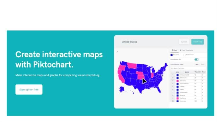
Create maps
Piktochart is a cloud-based application that allows you to create visual content. It offers a variety of features and tools that allow you to build high-quality, interactive charts. You can also use it to create posters, slideshow presentations, reports, and even social media graphics.
One of the best features of Piktochart is its easy-to-use interface. This makes it a perfect tool for people with no prior experience in the design industry. Also, it’s compatible with a wide variety of devices. If you are looking for a free and easy-to-use graphic software, then you should definitely try it out.
In addition to creating infographics, you can also make videos for social media. The graphics created with this software can help grab your audience’s attention.
Change the color scheme
The Piktochart color scheme is a feature that allows users to change the color palette used in a visual. It is part of the premium membership package. This is a useful tool to add more impact to your communication.
To use the color scheme option, click on the square tile in the top panel. The color buckets will appear, and you can change the colors. A pop-up window will ask you to enter the desired measurements. Once you’ve input the data, you can click the pencil icon to make adjustments.
You can choose from six brand colors. Alternatively, you can create your own custom colors. In order to change the color scheme, you must first set up an account. If you don’t have an account, you can sign up for a free version.
Find inspiration from other people’s infographics
There are a lot of places to find inspiration for creating an infographic. One of the most popular is Behance. You can also use Piktochart to find other people’s work.
Piktochart is a visual storytelling tool that allows you to create infographics in just minutes. It has a variety of free templates and graphics elements, including a library of more than a million images. The site also features a drag-and-drop editor that makes it easy to design your infographic.
Infographics are a great way to communicate information to your audience. They also allow you to increase interactions with your audience. Plus, they can help you spread your message faster. But how do you design a visual that’s both memorable and effective?
Use a variety of fonts. While you should be sure to choose readable, legible fonts, you can also add visuals, such as photos, instead of icons.